Saturday, March 24, 2018

Mr. West and the Night Watch


Click on the image for a larger view.

At Christmas time I received a set of Richeson casein paints and I’ve finally had a chance to start working with them. This is my first work in casein. I call it Mr. West and the Night Watch. I worked entirely with tints and tones of blue with the only other color being the orange glow of the tip of Mr. West’s cigarette. Since orange is the compliment of blue, the tip of the cigarette seems to nearly jump of the painting. My reference source was a photo of James Dean.  

This is also my first attempt at a style of painting known as a nocturne (unless you count one of my earlier watercolor painting I called Tink). Nocturnes, when used of paintings, typically depict scenes at night or twilight. They can be lit by moonlight or street light or some other source but they are clearly scenes that are taking place at night. Nocturnes often do not display as much detail, colors are very muted and edges are less defined. The next time you take a walk on a moonlit night, notice how colors and details are different from what you would see in the daylight. Nocturnes can convey a sense of mystery, eeriness and a romantic moodiness that I find fascinating. 

As I said, this is my first time working with casein paints. Back in art school I did a fair amount of work with gouache, which are similar to casein paints in that they are essentially opaque watercolors. They behave similarly and they dry to a similar matte finish. However, I think I like the feel of working with casein better than that of gouache. The casein paints seem to have a slightly more “buttery” feel to them. They dry very fast. If I apply one layer of pigment over another too soon after laying down the previous layer, the brush will lift up some of that previous layer. I’ve found that if I resist the urge to keep working on one spot and instead came back to it after working on another area, then lifting was less of a problem. Waiting until the next day was even better. This characteristic of casein may take a little getting-used-to but it is a good characteristic when I need to fix something. It allows me to scrub out something I don’t like and start over. My understanding is that after about a 2 week curing time, the paint becomes significantly water resistant, though not entirely waterproof. I’d like to do some more work with casein paints as they seem to suit my particular style. I’m also hoping to do some more nocturnes. 

Monday, December 25, 2017

Merry Christmas!

This is a digital illustration I did way back in 1999. My boss, at the agency where I worked at that time, enjoyed sending out an annual holiday package to clients and vendors and for about 7 years I designed and illustrated the card part of the package. This illustration was done with a  combination of Photoshop and...wait for it...Macromedia Illustrator.

Have a Merry Christmas and a Happy New Year!

Saturday, July 29, 2017

The Office Solutions 101 Logo Design


I’ve recently completed the above logo design for a company which specializes in, “Bringing structure, logic and control to the workplace by optimizing workflow,” and ...“increasing productivity and devising workplace solutions for new businesses or established businesses that need assistance with growth and organization.” 

In other words, perhaps you recognize that your work environment could stand to have a little order introduced into the chaos. And maybe some optimization or modernization could help you to trim some waste and save some valuable time and money. Perhaps you sense that with a little tweaking, or a lot of tweaking, your office could purr like the well-oiled machine you’ve always dreamed it could be. That’s where Office Solutions 101 comes in.

Click on any image for an enlarged view.


This logo consists of a logomark representing the initials “OS” (in the form of a globe or circle and a stylized letter “S”) along with the logo type in the typeface of Venera, weights 700 and 500. The colors are Pantone 376 C and black. The logo works well in grayscale, single color and reversed applications.

I’ve also designed the logo to work in a variety of formats. The format shown above I’m calling a hybrid, in that it is a combination of the stacked and horizontal formats shown below respectively.


The hybrid version is my favorite but the other two formats can come in handy under certain circumstances. 

I also did a couple of layouts suggesting how the logo could be used in social media platforms.


Designing a logo can be a bit like bringing order and efficiency to an office. You have to research the client’s business, identify what matters and what doesn’t and boil it down to the essence of the business, removing anything that impedes efficiency. In the end you have a clear, concise solution that works exactly the way it should and is flexible enough to adapt to the inevitable and changing factors of time and circumstance. 

Saturday, February 4, 2017

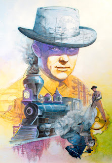
A Personal Project: The Wild Wild West

The Wild, Wild, West
(click any image for a larger view)

Personal projects are fun. I find it almost therapeutic when I can draw, design and/or paint something where I am my own art director and I can work at my own pace with no specific deadlines. I finished this personal project several months ago. It is a mixed media illustration of Robert Conrad as James West, the lead character from the 1960’s television show The Wild Wild West. The show featured two secret agents – James West and Artemus Gordon – chasing adventure and mystery in the untamed west. Part western, part spy fiction, part science fiction, it was campy and amazingly far fetched. But I loved it.


Every episode title begins with the words The Night of... There was The Night of the Inferno, The Night the Wizard Shook the Earth, The Night the Terror Stalked the Town and so on for four seasons. 

Robert Conrad did all of his own stunts for the show. He has even been inducted into the Stuntman’s Hall of Fame for his work on The Wild Wild West.  In fact he almost died in a stunt involving a chandelier in The Night of the Fugitives. If you have a chance to see this episode watch for the scene where he leaps from a balcony onto a chandelier only to land on his head.


Conrad was also an excellent horseman. In most episodes he could be seen riding a black American Quarter Horse. When the show’s producers realized he was such a skilled equestrian, they replaced his original horse with one possessing a little more spirit. Enter Shadow Trail, the horse he would ride for the remainder of the series. 

It is worth mentioning that the The Wild, Wild, West is credited as the originator of Steampunk. Steampunk is a subgenere of science fiction/fantasy in which modern technologies are re-imagined as steam powered machines of the 19th-century.


James and Artemus travel from adventure to adventure aboard their custom locomotive. Each episode begins with the train delivering them to their mission (some time early in the day) and ends with the train steaming them off into the mysterious night. 

I completed this illustration in graphite pencil, water soluble oils and colored pencils on a gessoed masonite board.

Sunday, February 14, 2016

A Color Value Illusion!

I do not claim credit for this post. I first saw this at what I consider to be the best illustration blog ever and I just have to share it and the original blog The Gurney Journey, a blog by master illustrator James Gurney of Dinotopia fame. Anyone who is interested in learning technique will absolutely love James Gurney’s blog. If you want to see Mr. Gurney’s original blog article where he explains the below phenomenon click here. While you are at his site, bookmark it and explore to your heart’s content.


The illusion:

Believe it or not, squares 1 and 2 below are exactly the same color and value.


Don’t believe it? 


Here is the proof:


Is art fun or what?

Again, if you are an artist you must visit The Gurney Journey! It is an absolute treasure trove of studio tips and insights on the visual arts. Enjoy!

Saturday, December 26, 2015

Dimensional Form and Stylized Letters: A Logo Design

A local contractor asked me to create a logo for his commercial business. He wanted the icon to be a stylized letter “C” positioned above the name of his company. 

This stylized “C” forms a solid, sturdy, building-block shape in bold colors which holds up well on both a white and a black background. It will look sharp on business cards and other stationery and business collateral as well as on hats, shirts and vehicles.


Logo ©2015 Tony Fendikevich

This logo shape started out as a cube. From this larger cube I “carved out” a smaller cube. By introducing a second color I can define the space around this smaller cube. This negative space interacts with the smaller cube to form the letter “C”.

2015 RIT Imaging Hall of Fame Inductees

Here are my portraits of this years inductees to the RIT Imaging Science Hall of Fame.

Top to bottom: Carolyn Porco, Bryce Bayer and Gary Starkweather.
(Click image for a larger view)