Monday, December 6, 2010

Digital Illustration (and the strangest assignment I've ever worked)

Untitled.
Click each image for a larger view

This was one of the strangest assignments on which I've ever had the pleasure of working. The client (an agency which shall remain nameless) asked me to illustrate 11 concepts but would not tell me the meaning behind the images I was expected to create.  Instead, the client would sit behind me during the entire illustration process and direct me on how they wanted each illustration to look. Apparently, the images were going to be used in a super-secret presentation. I believe the "classified" status has been lifted from the files so I am now free to talk about all I know concerning this assignment, which is very little.


I can tell you that I illustrated everything in Adobe Photoshop. I can also say that, in spite of the fact that the client basically sat on my shoulder like a parrot the entire time, I really enjoyed working on this project. It was like being in an episode of the X-Files.

Perhaps it is the map of a planned alien invasion of Earth whereby these aliens will use humans to power some sort of energy cubes. Maybe it explains how bits of information can be streamed through modern technology (well, technology that was modern at the time I did the illustrations about 10 years ago).

Yeah, I've got nothing. I don't have a clue what they mean.
 

Now, here are two digital illustrations I did for a company that makes large industrial mixing systems.  The mixing tanks are large enough to fit several people so you can imagine the size of the mixers.  


Again, these illustrations were done in Adobe Photoshop.

Saturday, October 30, 2010

The Saturn Cycling Classic

This is the completed full page ROP ad I designed (a little over a year ago) to locally promote the Rethink Saturn campaign and the Saturn Cycling Classic.

I illustrated the background elements of outer space and the planet Saturn in Adobe PhotoShop then layered on top of that a photomontage of images related to the Saturn Cycling Classic. The text came from the client.

Click for a larger view.

Here is the background image I created using Adobe PhotoShop. Perhaps one day I will write a post about illustrating in traditional vs. digital media. I like using both.

Thursday, October 28, 2010

Liquor Store Ad Campaign

Click each picture for a larger view.

This is an ad campaign I designed for a local liquor store. I also did the illustrations. Everything was done with Adobe InDesign.


Monday, October 18, 2010

More Phun with PhotoShop

A client who specializes in cosmetic procedures to remove unsightly veins from legs needed an ad with a Halloween theme. The general concept as described to me by the sales rep was to show a witch with attractive legs. I searched in vein (I mean vain) through stock photography for a photo matching this description. The selection was so disappointing that I decided to try a different approach. In other words, I was going to have to do this the hard way.


Rather than searching for photos with a Halloween theme I just filtered through dozens of photos of beautiful women with attractive legs (the things I have to do for my job) and found this photo. She looks like she is in her early twenties. A little young to require the Doctor's services but I have a plan to deal with that. She also  doesn't look like a witch. In fact, nothing about this photo even hints at a Halloween theme.


I added a few "Halloweenie" items like a broom, witch's hat (hides her young face) and a jack-o-lantern (all from separate photos). I also needed to ad some image area to the left side of the photo so it would properly fit the size of the ad space. To do this I cloned in some extra step image, grass and wall image. I didn't worry about the trees because I don't like them for what I have in mind. They are too summery and happy. I chose to swap them out for this...

Now that's the kind of tree a Halloween witch would like.


I also added some more crows. There is something creepy about crows, especially when they gang up like this. Now the overall scene is established. Still, it's all to summery. This witch might actually get a tan under these conditions!


I need to begin altering the atmosphere. A layer of blue set to multiply at about 63% opacity helps me to begin to change this daylight image to night. I also used PhotoShops lighting filter (omni light) on the tree to give the impression of moonlight coming from that direction. Next I made some value adjustments overall to focus attention on her legs.


Now I have to make this montage of separate elements look like they are all part of one photo. I altered the contrast on the hat and added shadows to the broom and the pumpkin. I also made adjustments to the flesh tones to give her a warmer glow.

Next I added another lighting effects filter to the steps (directional light). I airbrushed some darker areas around the edges. I changed the color of her shorts to black and airbrushed the wall into the shadows. I selectively added some fog using PhotoShops cloud rendering filter. Lastly, I put a brighter candle in the jack-o-lantern. The final image looks like this...

Click for a larger view.

I brought the final image into Adobe InDesign and added the text (with a ghostly glow) specified by the client. The final ad looks like this...

 Click for a larger view.

There are no spider veins on this witch!

Tuesday, September 7, 2010

An Interview with Chris Hopkins

 Paradise Theater (Front)
Click for a larger view.

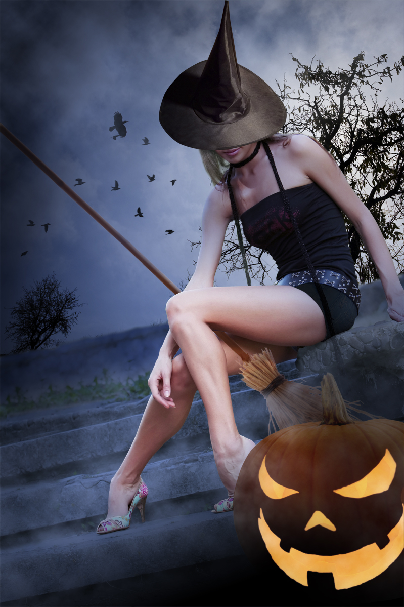
Paradise Theater (Back)

As I was growing up I found that one of the things I was able to do reasonably well was art. I enjoyed art class, I loved to draw and paint and I found inspiration in the work of professional illustrators. I studied their work and technique for hours, trying in vain to come close to their level.

One illustrator who inspired me then and continues to do so today is Chris Hopkins. His illustrations for the Styx album Paradise Theater continue to captivate me. I recently had the pleasure of talking with Chris Hopkins and thought I would share some of our conversation with you.

How long have you been an illustrator?
Well, I started when I was a student so I've been doing this since about 1978.

How has your style changed throughout your career?
When I started my style was tight airbrush work. This was back in the 1980s and I did a lot of work with the movie industry and the music industry. I did a lot of work for the entertainment industry back then. I don’t do as much illustration now. I do more painting for museums and I work with oils.

What was it like working in Los Angeles at that time?
That was a great time to be an illustrator. The budgets were better, we had great relationships with everyone. We were all doing traditional illustration work. This was pre-digital so everything was done traditionally. It was a great time.

How has the business changed since then?
It has changed radically. Most of the work is handled digitally now. So if an art director wants an illustration, rather than commission a piece he can go to a stock house and buy a photo and manipulate it digitally. It’s a more difficult time to be an illustrator. But on the good side, in some ways the work is more interesting now.

I’ve always admired your Paradise Theater illustration. The music on the album is good but in my opinion, the packaging is what ties it all together and makes it so memorable. Can you talk a little about that piece?
That was a good project. I did the illustration for the front and back of the album. I also did the illustration on the center disc of the record itself (this was also laser etched on the vinyl album) as well as the billboard advertisements and the sleeve for the 45 record. It was quite a project. There is a lot of interest today in that illustration. I no longer have the Paradise Theater illustration, but a lot of my other illustration work has been selling.

When my daughter was young she said she wanted to buy one of my illustrations. I asked her which one she wanted and she picked out an illustration I did for a poster for the second Indiana Jones movie, The Temple of Doom. I said, “Lets see how much you have in your piggy bank.” So we dumped out her change and she had about 98 cents. So she bought that illustration from me for 98 cents. Later when she was a junior in college there was growing interest in my illustration work and someone approached her to buy that illustration from her. She sold it and was able to pay for college.


Butterflies, The Tuskeegee Airmen (Oil on Canvas)
Click for a larger view.

What made you transition from airbrush painting to oil painting?
I really grew to dislike airbrush painting. Of course it’s not good for you to breathe in all that stuff. It’s also messy and you have to cut all the masks. Also, I could see that eventually digital art was going to replace airbrush work. I was working with an artist representative in New York and I told him that I wanted to do oil paintings. He asked me if I knew how to do that and I told him, “Sure I do”. I didn’t really know if I could do it but I was more of a risk taker back then. He called me the next day and told me he had an oil painting assignment for me and I just about soiled myself wondering how I was going to do it. But I did it and it worked out well and I’ve been doing that since.

You mentioned that you work with an artist representative. How did that come about?
Well I had been with a studio for awhile and came to know quite a few reps. When I left the studio in 1982 I was approached by a lot of reps. I chose some guys from New York and we’ve been great friends ever since.


Ronald Reagan (Oil on Canvas)

Ronald Reagan (Detail)
Click for a larger view.

I’d like to ask you some questions about your work process.  I’m thinking about the photographic realism of your work and specifically your painting of Ronald Reagan. How did you master the ability to render details such as skin wrinkles and bone structure in faces or the folds and wrinkles in clothing?
I've never had difficulty with that. With folds in fabric or with patterns on water, much of it I just make up, unless I’m doing a portrait and someone is likely to expect it to look exactly like the subject. I study the surface and begin to notice the core shadows which are soft edged and the cast shadows which are hard edged and as I begin painting them I just find a rhythm and I just carry that through. So I usually just make that stuff up. I also carry around a sketch book and I’m always filling up my sketch book for practice. Someday I’m going to pass my sketchbooks on to my kids and my grand children and they will be able to go through it and see the kinds of things that I would think up.

Do you prefer to paint from models or from photos?
I’ve done all of it. Sometimes I will set up a model but often I will just take my own photos and work form those. I might have a friend take a photo of me in a pose. When it comes to armor, I just make it up.


Winterstag, The Moor of Darkness (Oil on Canvas)
Click for a larger view.

What is the average size of your paintings?
The size really varies. I've worked from 36”x48” (sometimes smaller) and up to 6’X8’.

Do you ever make a mistake on a painting and worry that you've ruined it?
Of course I do. But I never say die. I’ll just scrape it off and rework it. I’ve been doing this long enough to know how to deal with that.

What advice do you have for anyone considering illustration as a career? 
Well, no one knows exactly where things are going in this business. There is a lot of debate about that. But today it's all digital. I don’t do digital work and I haven’t needed to because I’ve been doing this so long I’m grandfathered in. If you can learn to do digital I say go for it. But most of all, do what you love to do and don’t be dissuaded. These are difficult times to be in the business but don’t give up. Just do what you love to do.

Chris Hopkins is a true gentleman. It was an honor and a pleasure to talk with one of my illustration heroes.
To view more of Chris Hopkins work, visit his website http://www.chrishopkinsart.com/

All paintings and illustrations shown in this interview are by Chris Hopkins.

Saturday, August 7, 2010

"Tink" Revisited

Click for a larger view.

I've returned to an old subject but with a different approach. Usually, once I do an illustration I can move on to the next one. When I can't move on, when I feel compelled to try it again, I know something is wrong. Such is the case with "Tink," an illustration I did back in March. I was very happy with the first illustration but I still felt compelled to take another crack at it.

This time I simplified everything. I worked primarily in watercolor and color pencil  with just a little gouache. She looks much more innocent and "fairy-like" than my first attempt.

OK, I think I can move on now.

Monday, June 14, 2010

Elizabeth Taylor, Final

Click for a larger view

I finished this illustration using watercolor, gouache, india ink and colored pencils on illustration board.

Friday, June 11, 2010

"Elizabeth" In Progress

 
Pencil on Illustration Board
Click for a larger view

I'm working on this painting (of Elizabeth Taylor) for fun. I plan to finish this piece with watercolors and india ink. I found a really nice photo of her from the mid 1950s that I'm using for reference.

Tuesday, June 1, 2010

Indiana Jones

Watercolor and India Ink
Click for a larger view.

This is an illustration I did just for fun. I used watercolor and India ink on Crescent cold-pressed illustration board.

Indiana Jones is one of my favorite movie characters. In my opinion, Raiders of the Lost Ark is the best of the "Indy" movies. One of my favorite scenes is when Indy and Marion reunite in Marion's bar, in Nepal, having not seen each other for 10 years. The ensuing argument between them is one of the reasons I think the sceenplay written by Lawrence Kasdan is so excellent.

Tuesday, May 11, 2010

The Dragon Slayer Final

Watercolor on Crescent Cold Pressed Illustration Board
(Click for a larger view)

I've finished  my watercolor illustration of The Dragon Slayer! The slayer is engaged in an epic struggle with a fiery serpent. He clearly has experience with this sort of thing; his armor is crafted from the hide of a previously dispatched foe (note the horns in his helmet, the dragon scales  on his various guards, the under-belly plates protecting his chest and back, and the dragon teeth dangling decoratively from the tassels of his armor). Even while the death grip closes in around him he does not give in to fear. He steadies his aim, waiting for the moment when his enemy will expose its one weak spot (the roof of its gaping mouth).


As the dragon prepares a sulfurous blast of flame it is already too late. The slayer's arrow is set to fly.


The dragon slayer can't win on his own. He needs his brave horse to carry him into the thick of  battle. Perhaps the slayer's worthy and courageous friend  is soon to be fitted for some handsome red armor.

Sunday, April 25, 2010

The Dragon Slayer Sketch & Underpainting

(Click for a larger view)
This is the original rough sketch for a piece I'm working on now. It involves characters from bedtime stories I've made up for my kids since they were little. I think this dragon is too cute to kill or be killed (he looks like he wants to play "fetch") so I made some refinements to him and to the Dragon Slayer for the underpainting below.


Now that's a face only a mother could love. This is the underpainting for the piece. I'm using watercolors on Crescent cold pressed illustration board. I'll probably throw in some colored pencil and maybe some pastels by the time I'm done.

I don't always do a full underpainting in this manner. But in this case I think it will help me create the atmosphere I imagine for the scene. The Dragon Slayer and his trusty horse are wrapped in a warm embrace (a VERY warm embrace) by their fire spewing foe who may have just opened his mouth one too many times.
The whole scene is shrouded in fire and poisonous fumes.


Is the Dragon Slayer about to be fried or will he deliver the death blow to his adversary?

Monday, March 8, 2010

"Horse in the Meadow"

 
Watercolor on Strathmore illustration board.
Click image for a larger view.

I did this painting several years ago but I like it so I decided to post it. It expresses the idea of freedom; a horse standing in the middle of a wind-swept grassy meadow with no fences to keep him and no pressing deadlines (er, cowpokes) to stress him out.

Saturday, February 6, 2010

Package Design

 
Yu-Gi-Oh! Trading Card Packaging

By package design, I don't mean the design of the physical construction of the packaging. Rather, I mean the design of the graphic elements on the packaging. I've had the pleasure to work on quite a few projects of this nature, including the above packaging for Legends edition of Yu-Gi-Oh! trading cards. This packaging required 8 different color schemes, 3 of which you see here. It also required lots of illustration and photo composite work.


CD packaging can be a very fun challenge. I designed the packaging elements of this music CD for Northridge Church's collection of worship music titled Vertical Worship.


I've enjoyed having the opportunity to design quite a few themes for Perry's line of ice cream products. Panda Paws is their number 2 selling flavor (just behind vanilla). I designed the front panel of this ice cream package, directed the photo shoot, and illustrated the background in watercolor. Since ice cream melts under the hot lights of a photo shoot, a food stylist is hired to create something that looks like ice cream but doesn't melt. All of the food stylists I've worked with have their own unique recipes for fake ice cream...but I don't think any of it is edible.


Thankfully, Monkey Mania didn't require photo direction. Imagine trying to photo-direct three monkeys eating ice cream! I did design and execute the illustration (using Macromedia Freehand and Adobe PhotoShop).


I love chocolate, coffee AND ice cream so designing for this flavor was a pleasure. No illustration required for this one but there was a great deal of photo composite work. I believe there were 5 different photo elements to be combined here.


I won an award for the design of the packaging for Perry's line of novelty products. At the time I believe there were 9 different products in this line (now there are more).  

One of the greatest perks of working on retail packaging is that the grocery store or retail outlet becomes your art gallery! It is so fun to walk into the grocery store and see your work on their shelves. And at family gatherings, when someone breaks out the Panda Paws ice cream I get to hear my wife say for the one thousandth time "Hey, my husband designed that!" I never get tired of hearing her say it!

Saturday, January 23, 2010

Logo Design


Click on the image for a larger view.

This logo for Northridge Church is my latest design. The logo is designed around a compass theme, both because of the name Northridge and because of the structural organization of this church's programs. The compass points due north (or up toward the heavens). The color blue keeps with the nautical theme of the compass (the church also does baptisms in Lake Ontario) and also suggests the color of the sky and a heavenly focus.

Here are some of my other logo designs:


Not all designs get chosen. This logo design for one of the Democrat and Chronicle's internet sites was not selected as the final design, but I still like it.


Legends is a trading card company based in Rochester. I designed this logo for them back around 1995. They are still using it today. In the world of logo design, that's very good.


No, this Marty is not me. This Marty sells hunting supplies. He also wanted his dog in the logo! So, not only did I stylize this typeface, I also did what I consider to be a rather nice illustration of his dog.


The Black Pearl and Antonetta's are restaurants.


I designed this logo to have a stamped-on look. I don't think this company is still in business. Obviously, having a good logo alone doesn't ensure success. But it's better than having a bad logo.

I hope to discuss the development of my own logo in a future entry.

Saturday, January 2, 2010

The Triumphal Entry


The Triumphal Entry
Watercolor
(click on images for a larger view)

I experimented a little with technique on this piece. I mixed egg yolk in with my watercolors and painted on a surface of gessoed Crescent cold pressed illustration board. This was a fun technique that had some interesting effects. It reminds me a little of acrylic glaze painting however and for control I think I prefer acrylics. If I try this technique again I would like to use true gesso (not the acrylic polymer that usually passes for gesso these days) or I may try just working right on the surface of the illustration board.

If anyone out there has any suggestions on this technique let me know via the comments link at the end of this entry.


I have always felt a little uncomfortable with illustrations of Christ that portray him with a specific likeness. By covering his face with the Hebrew prayer shawl (or tallit) I am attempting to avoid doing so myself.


You may notice that the colt looks more like a horse than a colt. That was intentional on my part. I am attempting to suggest that there was more going on in this scene than meets the eye. I am trying to cast a forward glance toward Revelation 19 where Christ is seen returning on a white horse.