Tuesday, June 16, 2020

ESOP the Ant

Not long ago my current employer asked me to create a character to represent their ESOP (Employee Stock Ownership Plan). Playing off of the acronym ESOP, I put together several fun character sketches based on Aesop’s Fables. Of those, the character which I was asked to develop further was Esop the Ant.


Here is my original marker sketch of Esop.
Click any image for a larger view.


I work in a very demanding environment. It is not uncommon for me to be working simultaneously on several complex and time-consuming projects all with tight deadlines, only to have someone come up to me and say, “We need such-and-such and we need it in an hour.” I know that I will certainly be asked to show Esop in different poses and from different angles and (9 times out of 10) my turnaround time will need to be immediate. In those situations, the well constructed vector file is my friend. Vector files are flexible, allow for easier revisions than other formats and are scalable to any size. 


If you have ever played the game Cooties, by Hasbro, then you can understand the method by which I wanted to build Esop. I created multiple versions of his head, showing it from different angles and with different facial expressions. I did the same for his body and limbs. Again, click any image below to see a larger version.


Early on I provided several color variations 
of Esop. Dark blue was the chosen color.


With a complete set of Esop parts, I – or any of my colleagues, regardless of their illustration abilities – can quickly and easily assemble Esop into any number of poses, shown from several angles, with different facial expressions. 


Granted, since we use Esop in communications relating to our employee stock ownership plan, we hope to never have to show Incredulous Esop, or Worried Esop and certainly not Angry Esop (I didn’t even bother to make Sad Esop). Still, it is nice to have those options available and to be able to show Esop with a wide range of emotions.


May Esop’s face always have a smile!


Friday, May 22, 2020

A Man Called Marlowe

Click on any image to see a larger view.

My latest personal project is this painting of Raymond Chandler’s famous detective, Philip Marlowe. 

I enjoy Chandler’s writing and I have for some time wanted to illustrate a scene from one of his stories or a representation of Marlowe the character. The current pandemic and resulting quarantine has provided me with the time to do it. I painted this with water soluble oils on a gessoed masonite panel.

Some Background

Raymond Chandler had been the Vice President of the Dabney Oil Syndicate. The Great Depression, along with his fondness for alcohol and his female employees, changed all of that. By 1932 he was unemployed. That’s when Chandler decided to take up writing.

Chandler started writing short stories for what were commonly called “pulp magazines.” His first printed story was Blackmailers Don’t Shoot, written in 1933 for the magazine Black Mask. Chandler’s stories were hard-boiled mysteries featuring an assortment of detectives and other tough-guy protagonists fighting the good fight against killers, drug dealers, gamblers the mob and more. In 1939, at the age of 51, he wrote his first novel, The Big Sleep, in which he introduced his straight-talking, quick-witted, private investigator Philip Marlowe.


My finished sketch for the painting

In retrospect, one can see Marlowe developing throughout Chandler’s earlier stories. There are little bits and pieces of him in the detectives Dalmas (Red Wind), Delaguerra (Spanish Blood), Carmady (Gold Fish) and Grayce (The King in Yellow). 

Marlowe, however, is Chandler’s masterpiece. He is a man of modest means and high ethical standards. He takes his job and the privacy of his clients very seriously, albeit with a wry sense of humor. He is tenacious when pursuing a case and has been known to refuse payment when he fails to meet his client’s objectives or his own high standards. Smart and with a strong sense of character, he still manages to occasionally misjudge people and situations and pays a heavy price for doing so. He likes women but has firm boundaries. He drinks but not to the point of being an alcoholic. He smokes cigarettes as was common at the time. He speaks the language that the common man of his time spoke, our modern sensitivities not withstanding. 

In The Big Sleep, Chandler subtly uses the imagery of the medieval Knight as a hint to Marlowe’s character. We can also sleuth through Chandler’s other novels to learn much about Marlowe’s character, even watching it weather under the strain of his job, his friendships and his more intimate relationships. 

Chandler’s own problem with alcohol even takes a toll on Marlowe. In The Long Goodbye, Chandler appears to have written himself into two characters in the story, both of whom are alcoholics befriended by Marlowe. It is revealing to see Marlowe pull no punches as he confronts these men, and by proxy Chandler himself, berating them for their self-absorption and destructive lifestyles.

Marlowe is a reflective individual and I think 
this quality comes through in my painting.

When it comes to Marlowe's physical appearance and his personal history, Chandler (who is known for his very descriptive writing) brilliantly leaves us with a lot of mysterious blanks to fill in on our own. We know Marlowe was born and raised in Santa Rosa California but by the time we meet him he has no family. With regard to his age, in the Big Sleep he is in his early 30s but in the other novels he is in his early 40s. We know he used to be a detective for the District Attorney of Los Angeles but he was fired for “talking back.” He has brown hair and brown eyes, is about 6 feet tall, 190 pounds. That’s pretty much all we know about him. So when I decided try to illustrate Marlowe, I turned to what is probably the most descriptive, Marlowe-focused paragraph in all of Chandler’s novels – the paragraph that gives us our very first glimpse of the man – the very first paragraph of The Big Sleep.


It was about eleven o'clock in the morning, mid October, with the sun not shining and a look of hard wet rain in the clearness of the foothills. I was wearing my powder-blue suit, with dark blue shirt, tie and display handkerchief, black brogues, black wool socks with dark blue clocks on them. I was neat, clean, shaved and sober, and I didn't care who knew it. I was everything the well-dressed private detective ought to be. I was calling on four million dollars.

Here we see Marlowe dressing his best for a very important interview and a chance to land a wealthy client. He’s feeling confident. It looks like a pretty straight forward job. A millionaire’s daughter is being blackmailed and Marlowe needs to lean into the blackmailer and flex enough muscle to make him stop. Soon however, Marlowe will realize this case is anything but simple, as he finds himself knee-deep in more danger, filth and evil than he could have imagined. There are monsters in this story. They don’t spit fire but their guns do. The knight setting out to rescue the wealthy man’s daughter is about to have his armor seriously tested. By the end of this story, he is going to need more than a can of Brasso to restore whatever shine it once had. In The Big Sleep as well as the other novels, Marlowe’s armor will receive many dents and scratches – mostly around the helmet and over the heart.


To represent the mystery and danger Marlowe faces in this case, I painted the background as a fog split by a blood red swath. Within the red space I added a couple of details suggestive of the time period (represented by the 1939 Packard) and the location of Los Angeles, California (represented by the palm trees).


Also suggestive of the impending danger is the wind rustling Marlowe’s tie and suit jacket, revealing a glimpse of his holstered Luger automatic.
 

I could not resist placing this illustration into a mock book cover. I set the type to resemble the pulp magazine mastheads and the book covers of the 1930s and 40s.


In his essay, The Simple Art of Murder, Chandler uses words to paint us a portrait of Philip Marlowe that is better than any illustrator could ever make with paint and brush:


“In everything that can be called art there is a quality of redemption. It may be pure tragedy, if it is high tragedy, and it may be pity and irony, and it may be the raucous laughter of the strong man. But down these mean streets a man must go who is not himself mean, who is neither tarnished nor afraid. The detective in this kind of story must be such a man. He is the hero, he is everything. He must be a complete man and a common man and yet an unusual man. He must be, to use a rather weathered phrase, a man of honor, by instinct, by inevitability, without thought of it, and certainly without saying it. He must be the best man in his world and a good enough man for any world. I do not care much about his private life; he is neither a eunuch nor a satyr; I think he might seduce a duchess and I am quite sure he would not spoil a virgin; if he is a man of honor in one thing, he is that in all things. He is a relatively poor man, or he would not be a detective at all. He is a common man or he could not go among common people. He has a sense of character, or he would not know his job. He will take no man’s money dishonestly and no man’s insolence without a due and dispassionate revenge. He is a lonely man and his pride is that you will treat him as a proud man or be very sorry you ever saw him. He talks as the man of his age talks, that is, with rude wit, a lively sense of the grotesque, a disgust for sham, and a contempt for pettiness. The story is his adventure in search of a hidden truth, and it would be no adventure if it did not happen to a man fit for adventure. He has a range of awareness that startles you, but it belongs to him by right, because it belongs to the world he lives in.

If there were enough like him, I think the world would be a very safe place to live in, and yet not too dull to be worth living in.”

This description of Chandler’s detective hero fits Marlowe perfectly, at least in his earlier novels. In my opinion, Chandler strays from this ideal in his later novels, enough so as to damage Marlowe’s character. Maybe this was due to Chandler’s drinking or to other problems in his personal life. For this reason, I see the first five novels as Chandler’s best, with The Big Sleep as his magnum opus. 


All Illustrations © 2020, by Martin Jamison 


Tuesday, March 31, 2020

Moonlight

Click any image for a larger view

I’ve just finished my latest painting and this is another nocturne. There is something about nocturnes, the inherent mystery, the moodiness, the almost otherworldly eeriness of a scene illuminated by moonlight. Trying to capture this in a painting is challenging.

I used water soluble oils on canvas. I took my direction for this painting from the works of the famous painter of the American West (and master of the nocturne) Mr. Frank Tenney Johnson, as seen below: 


In my opinion Mr. Johnson has no equal when it comes to painting either western scenes or nocturnes.  He had an amazing way of painting only the detail that was necessary, with some parts of his paintings left essentially unfinished, or with details rendered by nothing more than a brief scrub of color. 


Here is Johnson’s painting The Pony Express.


Notice his attention to detail on this part of his painting...


...while elsewhere just a couple of brushes of color become a rock formation...


...or a mountain .


What captivates me most about Johnson's paintings is the way he renders the moonlit sky. 

I couldn’t find much in the way of research regarding Mr. Johnson’s technique except that he would prime his canvas with a slightly reddish tone. In researching other artist’s approach to nocturnes, the recommendation I found helpful was with regard to the underpainting. 

Rather than using the complimentary color to the intended overpainting (orange to blue, for example), the recommendation was to think in terms of warm vs. cool; make the underpainting warm so that the cooler color of the finished night sky seems more illuminated. My approach to this was to use dioxine purple at the outer edges blending gradually warmer toward the center for the underpainting — for the sky only. For everything else I used burnt umber mixed with a little ultramarine blue. 


I tried to keep my detailed work on the horseman and his train with a  minimalistic approach on the nonessential details but I found this to be more difficult than expected as I kept wanting to add details even in non-essential areas. Knowing which areas to keep vague and less detailed takes practice to be sure.

Here are some other nocturne. Notice the different approaches to rendering realistic subjects in moonlight. 


Mead Scheaffer


Charles Rollo Peters


Artist Unknown

In researching how we see the world around us under the light of the moon, I’ve learned that moonlight tends to steal color from that which it illuminates. Objects such as flowers which are vibrant with color when lit by direct sunlight become more gray. Landscapes which we would see as green in daylight become gray as well.


Further, if we stare at them long enough (without any artificial light to spoil the effect) that gray landscape will become blue. This explains why so many artists and even film makers resort to using blues or blue greens when depicting moonlit scenes. But why do we perceive as blue that which we are actually seeing as gray? We know the moon is not blue. In fact, we know it is just reflecting, albeit with less intensity, the same sunlight that illuminates everything so brilliantly during the day. 

To make things more interesting, try reading a book under moonlight. The page will look bright, but if you stare at the words they will fade away! 

The reason for all of this has to do with how our eyes work. Our eyes have two different kinds of cells for detecting light: cones and rods. The cones are stimulated in bright light and are very good at seeing color and details. In dim light cones become less active and the rods more active. The rods, however, are colorblind. Also, the central part of our retina, which we use for reading, is full of cones and has no rods. So at night, when those cones become inactive, we experience a blind spot in that very area of the retina which we use for reading.


This still leaves us with the question of why do we perceive moonlit objects as having a bluish/greenish color? Science simply does not supply a firm answer. I suspect that our brains just take some artistic license by “seeing” blue in moonlight as it attempts to interpret a gray world we normally see as very colorful. A more convincing scientific theory is that rods are not completely colorblind but are slightly sensitive to light in the blue/green end of the spectrum.

For a much more complete explanation of the scientific perspective, please see this article by NASA (its where I found all of my information on how the eye perceives color and I basically lifted the information from there):
https://science.nasa.gov/science-news/science-at-nasa/2006/28sep_strangemoonlight

Here is another wonderful article about our perception of color in moonlight:
http://gurneyjourney.blogspot.com/2008/01/is-moonlight-blue.html

For the present, the Moon continues to keeps it’s secrets! 


Saturday, March 24, 2018

Mr. West and the Night Watch


Click on the image for a larger view.

At Christmas time I received a set of Richeson casein paints and I’ve finally had a chance to start working with them. This is my first work in casein. I call it Mr. West and the Night Watch. I worked entirely with tints and tones of blue with the only other color being the orange glow of the tip of Mr. West’s cigarette. Since orange is the compliment of blue, the tip of the cigarette seems to nearly jump of the painting. My reference source was a photo of James Dean.  

This is also my first attempt at a style of painting known as a nocturne (unless you count one of my earlier watercolor painting I called Tink). Nocturnes, when used of paintings, typically depict scenes at night or twilight. They can be lit by moonlight or street light or some other source but they are clearly scenes that are taking place at night. Nocturnes often do not display as much detail, colors are very muted and edges are less defined. The next time you take a walk on a moonlit night, notice how colors and details are different from what you would see in the daylight. Nocturnes can convey a sense of mystery, eeriness and a romantic moodiness that I find fascinating. 

As I said, this is my first time working with casein paints. Back in art school I did a fair amount of work with gouache, which are similar to casein paints in that they are essentially opaque watercolors. They behave similarly and they dry to a similar matte finish. However, I think I like the feel of working with casein better than that of gouache. The casein paints seem to have a slightly more “buttery” feel to them. They dry very fast. If I apply one layer of pigment over another too soon after laying down the previous layer, the brush will lift up some of that previous layer. I’ve found that if I resist the urge to keep working on one spot and instead came back to it after working on another area, then lifting was less of a problem. Waiting until the next day was even better. This characteristic of casein may take a little getting-used-to but it is a good characteristic when I need to fix something. It allows me to scrub out something I don’t like and start over. My understanding is that after about a 2 week curing time, the paint becomes significantly water resistant, though not entirely waterproof. I’d like to do some more work with casein paints as they seem to suit my particular style. I’m also hoping to do some more nocturnes. 

Monday, December 25, 2017

Merry Christmas!

This is a digital illustration I did way back in 1999. My boss, at the agency where I worked at that time, enjoyed sending out an annual holiday package to clients and vendors and for about 7 years I designed and illustrated the card part of the package. This illustration was done with a  combination of Photoshop and...wait for it...Macromedia Illustrator.

Have a Merry Christmas and a Happy New Year!

Saturday, July 29, 2017

The Office Solutions 101 Logo Design


I’ve recently completed the above logo design for a company which specializes in, “Bringing structure, logic and control to the workplace by optimizing workflow,” and ...“increasing productivity and devising workplace solutions for new businesses or established businesses that need assistance with growth and organization.” 

In other words, perhaps you recognize that your work environment could stand to have a little order introduced into the chaos. And maybe some optimization or modernization could help you to trim some waste and save some valuable time and money. Perhaps you sense that with a little tweaking, or a lot of tweaking, your office could purr like the well-oiled machine you’ve always dreamed it could be. That’s where Office Solutions 101 comes in.

Click on any image for an enlarged view.


This logo consists of a logomark representing the initials “OS” (in the form of a globe or circle and a stylized letter “S”) along with the logo type in the typeface of Venera, weights 700 and 500. The colors are Pantone 376 C and black. The logo works well in grayscale, single color and reversed applications.

I’ve also designed the logo to work in a variety of formats. The format shown above I’m calling a hybrid, in that it is a combination of the stacked and horizontal formats shown below respectively.


The hybrid version is my favorite but the other two formats can come in handy under certain circumstances. 

I also did a couple of layouts suggesting how the logo could be used in social media platforms.


Designing a logo can be a bit like bringing order and efficiency to an office. You have to research the client’s business, identify what matters and what doesn’t and boil it down to the essence of the business, removing anything that impedes efficiency. In the end you have a clear, concise solution that works exactly the way it should and is flexible enough to adapt to the inevitable and changing factors of time and circumstance. 

Saturday, February 4, 2017

A Personal Project: The Wild Wild West

The Wild, Wild, West
(click any image for a larger view)

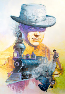
Personal projects are fun. I find it almost therapeutic when I can draw, design and/or paint something where I am my own art director and I can work at my own pace with no specific deadlines. I finished this personal project several months ago. It is a mixed media illustration of Robert Conrad as James West, the lead character from the 1960’s television show The Wild Wild West. The show featured two secret agents – James West and Artemus Gordon – chasing adventure and mystery in the untamed west. Part western, part spy fiction, part science fiction, it was campy and amazingly far fetched. But I loved it.


Every episode title begins with the words The Night of... There was The Night of the Inferno, The Night the Wizard Shook the Earth, The Night the Terror Stalked the Town and so on for four seasons. 

Robert Conrad did all of his own stunts for the show. He has even been inducted into the Stuntman’s Hall of Fame for his work on The Wild Wild West.  In fact he almost died in a stunt involving a chandelier in The Night of the Fugitives. If you have a chance to see this episode watch for the scene where he leaps from a balcony onto a chandelier only to land on his head.


Conrad was also an excellent horseman. In most episodes he could be seen riding a black American Quarter Horse. When the show’s producers realized he was such a skilled equestrian, they replaced his original horse with one possessing a little more spirit. Enter Shadow Trail, the horse he would ride for the remainder of the series. 

It is worth mentioning that the The Wild, Wild, West is credited as the originator of Steampunk. Steampunk is a subgenere of science fiction/fantasy in which modern technologies are re-imagined as steam powered machines of the 19th-century.


James and Artemus travel from adventure to adventure aboard their custom locomotive. Each episode begins with the train delivering them to their mission (some time early in the day) and ends with the train steaming them off into the mysterious night. 

I completed this illustration in graphite pencil, water soluble oils and colored pencils on a gessoed masonite board.