A client who specializes in cosmetic procedures to remove unsightly veins from legs needed an ad with a Halloween theme. The general concept as described to me by the sales rep was to show a witch with attractive legs. I searched in vein (I mean vain) through stock photography for a photo matching this description. The selection was so disappointing that I decided to try a different approach. In other words, I was going to have to do this the hard way.
Rather than searching for photos with a Halloween theme I just filtered through dozens of photos of beautiful women with attractive legs (the things I have to do for my job) and found this photo. She looks like she is in her early twenties. A little young to require the Doctor's services but I have a plan to deal with that. She also doesn't look like a witch. In fact, nothing about this photo even hints at a Halloween theme.
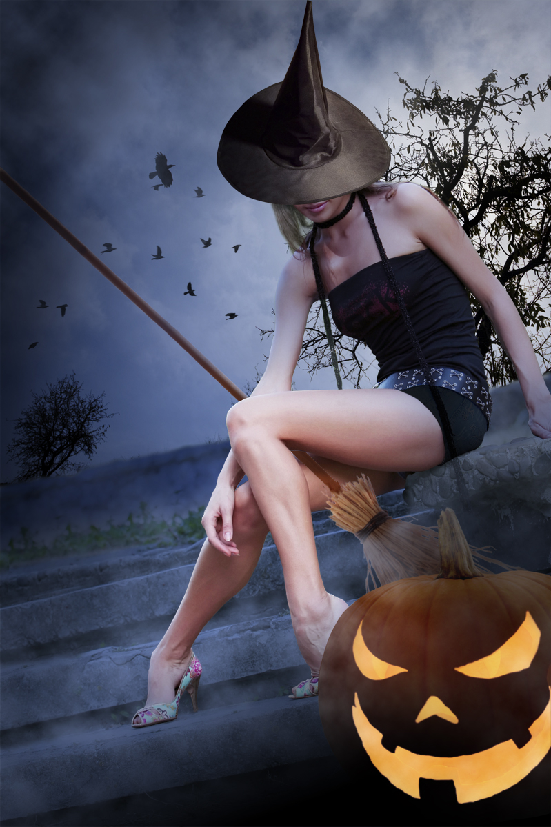
I added a few "Halloweenie" items like a broom, witch's hat (hides her young face) and a jack-o-lantern (all from separate photos). I also needed to ad some image area to the left side of the photo so it would properly fit the size of the ad space. To do this I cloned in some extra step image, grass and wall image. I didn't worry about the trees because I don't like them for what I have in mind. They are too summery and happy. I chose to swap them out for this...
Now that's the kind of tree a Halloween witch would like.
I also added some more crows. There is something creepy about crows, especially when they gang up like this. Now the overall scene is established. Still, it's all to summery. This witch might actually get a tan under these conditions!
I need to begin altering the atmosphere. A layer of blue set to multiply at about 63% opacity helps me to begin to change this daylight image to night. I also used PhotoShops lighting filter (omni light) on the tree to give the impression of moonlight coming from that direction. Next I made some value adjustments overall to focus attention on her legs.
Now I have to make this montage of separate elements look like they are all part of one photo. I altered the contrast on the hat and added shadows to the broom and the pumpkin. I also made adjustments to the flesh tones to give her a warmer glow.
Next I added another lighting effects filter to the steps (directional light). I airbrushed some darker areas around the edges. I changed the color of her shorts to black and airbrushed the wall into the shadows. I selectively added some fog using PhotoShops cloud rendering filter. Lastly, I put a brighter candle in the jack-o-lantern. The final image looks like this...
Click for a larger view.
I brought the final image into Adobe InDesign and added the text (with a ghostly glow) specified by the client. The final ad looks like this...
Click for a larger view.
There are no spider veins on this witch!


