Saturday, May 24, 2014

Design Campaign for a Catering and Events Business

I made this glass button representation of their existing logo.

Red Osier Catering is a catering and event off-shoot of the restaurant I featured in my previous post. They have several permanent storefront locations and a presence at many event locations throughout the Rochester area.


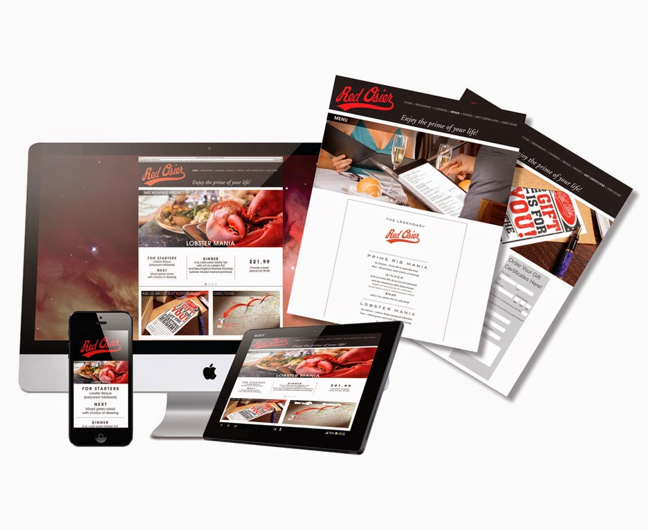
I recently designed a new branding campaign for the company which included outdoor venue signage and banners in various sizes, take-home menus tailored specifically for locations at the Greater Rochester Airport, the Monroe County Office Building in downtown Rochester and the catering location. The campaign also included print and online advertising as well as designs for their social media efforts.

I used the red color from their logo as the primary branding color for the business. From this I created a custom background style which I use in almost all, if not all, of their marketing pieces. Font usage and typesetting is also consistent throughout the campaign.

Some of their outdoor signage.


Print advertising for the campaign.


Social media and online advertising for the campaign.


I tailored these menu designs to fit their several locations. 


Sunday, May 18, 2014

Restaurant Campaign


This local Restaurant is an excellent dining established located in Stafford, New York. The restaurant has a loyal following but the owners would like to increase the patronage of their traditional customers while growing their younger customer base. The problem for this restaurant is location, location, location. It is situated in the middle of a very rural community about halfway between Rochester and Buffalo, so their customers are facing about a 45 minute drive from either direction. Complicating things even more is the growing competition from steak house chains. 

The media company which employees me approached the restaurant’s management with a plan to tackle this problem. As the graphic designer on the team, my task was to design a campaign which would:
  • Reengage the existing customer base
  • Grab the attention of the younger crowd
  • Make a lasting impression with potential customers 

To accomplish this I needed a strong conceptual approach that would:

  • Demand attention
  • Compete with the slick advertising of the chains
  • Minimize (if not neutralize) the perceived distance/location problem
  • Redesign their current website to improve user experience across all platforms from desktop to tablet to smart phone. 

I did this and more, designing a comprehensive campaign for the client with everything from print and online advertising to a new website and even new menus and gift certificates. Here is the campaign – All of the pricing seen below is for placement purposes only and is not necessarily accurate:


Click any image for a larger view. 


When I went to my initial visit with the client, one of the first thoughts that came to the mind of this city boy was, “This is crop circle country!” After they served me a delicious lunch my thought was, “I think people WILL travel light years for this excellent meal and atmosphere.” These initial thoughts formed the basis of my “They Came from Far, Far Away” concept. It is intended as the attention getting start of the overall print and online advertising campaign. If some folks are willing to travel light years for a great dining experience, 45 minutes suddenly doesn’t seem so bad. The main images of the cow, chicken and lobster required extensive Photoshop composite/illustration work.


Following on the heels of this first salvo is a more traditional message. Still maintaining the new branding approach of the custom typography, photos of young customers and price incentives, I’ve switched out the very conceptual imagery with beauty shots of food. These photos are for placement only and are expected to be replaced with custom photography. The only photo which may remain is the lobster.


Newspaper insert (front and back)


Here is a close up of the map from the insert.


Social media messaging.


Responsive website design.


Menu design (including a trifold brochure for clients to take home).


Redesigned gift certificates to appeal to a broader demographic.


In the end, the client decided they want to keep their existing web site and only use some of the print elements of the campaign. Not a slam dunk for me, but I hope even this will help them grow their customer base. 

Thursday, May 15, 2014

Kerning in 5 Easy Steps

Kerning refers to the spacing between any 2 individual letters. For example, in the word TYPESETTING we can kern the space between the letters T and Y or between the letters N and G or between any of the other letter pairs in that word. 

Tracking (sometimes called “letter spacing”) refers to the spacing between all of the letters in a word or a block of text.


Click each image for a larger view.


Although kerning deals with the spacing between two letters, I like to use an approach which has me focus on three letters at a time. I believe this approach is attributed to typographer and designer Ed Benguiat. When I need to adjust the kerning / tracking of a word (while designing a logo for example) I typically follow this process:


Step 1: Customize your kerning/tracking increments in preferences. In InDesign you will find the Kerning / Tracking increments setting under InDesign / Preferences / Units & Increments. The default in InDesign is 20/1000 em. Personally, I like to set this to 5/1000 em simply because some letter relationships require a finer adjustment than the default of 20 will allow. Changing this setting to 5 gives me all the control I need. Now I can place my text tool’s I-beam cursor between letters and add or remove kerning by holding down the command key (Mac) while pressing either the left or right arrow keys.


I can also manually type smaller or larger increments 
for each individual letter using the kerning and tracking 
settings as found on the control panel.


Step 2: Using the 3 letter approach, I zoom in close enough to focus on just three letters. It is tempting to start at the beginning of the word, working left to right. However, I like to do a quick pass across the word to see if I notice any grouping of three letters that already looks “correct.” In this case, I do not see such a grouping but the letters ETT appear to be nearly correct so I’m going to start with them. By just tweaking the spacing between E and T, I now have my first grouping of three as a standard by which to judge the other groupings.


I will continue moving left – focusing on the letters SET, or right – focusing on TIN, making adjustments to three letters at a time and intuitively balancing the positive and negative space between the letters until I have covered the entire word. Many times this first run is sufficient to correct the kerning of a word. Often times, however, I encounter a combination of letters that is more challenging. In those situations, I add the following steps:


Step 3: Next, I like to rotate the word so it is upside-down. Then I go through the same process of examining 3 letters at a time, making adjustments as needed.


Step 4: Rotating the word back to the right-side-up position, I now flip the word horizontally, so it is backward, and examine it again, three letters at a time. Steps 3 and 4  help me to have a fresh view of the spatial relationships of each grouping of letters, allowing me to see these letters more as graphic shapes than as letters. I often find that when I go through steps 3 and 4, I will see something I would have missed had I stopped at step 1. 

Step 5: Satisfied that I have the kerning correct, I flip it back to the normal position to read from left to right. I now zoom back from the word to judge it for legibility.


These letters have been kerned but no tracking adjustments have been made.

Examining for legibility is similar to examining letter spacing. Only this time, I am looking at the whole word to see how the kerning adjustments I have just made affect my ability to quickly scan (read) and understand the word as a whole. Looking at the word in this way, I feel that the overall space between letters is too tight. There are times when extremely tight or loose tracking can be used for effect, but in this case I’m not going for either effect. I want to “open up” this spacing a little so I’m going to increase the tracking by selecting the whole word and using the same key commands I used for kerning. This requires a simple judgment call. I increase the tracking until the spacing looks more “comfortable.”


A Final Note: In my opinion, the letter I requires a bit of extra treatment. Since this letter takes up less overall real estate than the other glyphs, I find that it can become a little lost or overlooked if it is kerned consistently with the other letters. For this reason I like to add a little more kerning on either side of I just to help it out.


Fini!

And that’s it...kerning in 5 easy steps!