
The media company which employees me approached the restaurant’s management with a plan to tackle this problem. As the graphic designer on the team, my task was to design a campaign which would:
- Reengage the existing customer base
- Grab the attention of the younger crowd
- Make a lasting impression with potential customers
To accomplish this I needed a strong conceptual approach that would:
- Demand attention
- Compete with the slick advertising of the chains
- Minimize (if not neutralize) the perceived distance/location problem
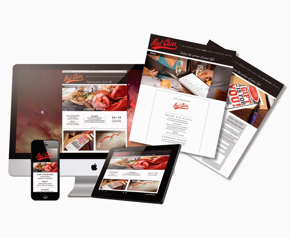
- Redesign their current website to improve user experience across all platforms from desktop to tablet to smart phone.
I did this and more, designing a comprehensive campaign for the client with everything from print and online advertising to a new website and even new menus and gift certificates. Here is the campaign – All of the pricing seen below is for placement purposes only and is not necessarily accurate:
Click any image for a larger view.


When I went to my initial visit with the client, one of the first thoughts that came to the mind of this city boy was, “This is crop circle country!” After they served me a delicious lunch my thought was, “I think people WILL travel light years for this excellent meal and atmosphere.” These initial thoughts formed the basis of my “They Came from Far, Far Away” concept. It is intended as the attention getting start of the overall print and online advertising campaign. If some folks are willing to travel light years for a great dining experience, 45 minutes suddenly doesn’t seem so bad. The main images of the cow, chicken and lobster required extensive Photoshop composite/illustration work.

Following on the heels of this first salvo is a more traditional message. Still maintaining the new branding approach of the custom typography, photos of young customers and price incentives, I’ve switched out the very conceptual imagery with beauty shots of food. These photos are for placement only and are expected to be replaced with custom photography. The only photo which may remain is the lobster.


Newspaper insert (front and back)
Here is a close up of the map from the insert.
Social media messaging.
Responsive website design.
Menu design (including a trifold brochure for clients to take home).
Redesigned gift certificates to appeal to a broader demographic.
In the end, the client decided they want to keep their existing web site and only use some of the print elements of the campaign. Not a slam dunk for me, but I hope even this will help them grow their customer base.
No comments:
Post a Comment